Old UI
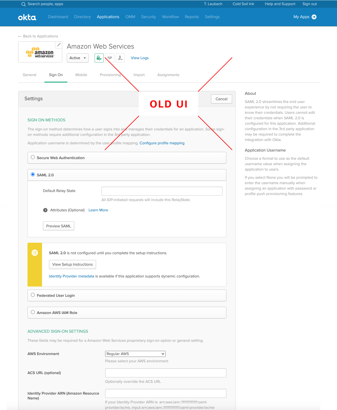
Here's what the UI looked like for an example integration
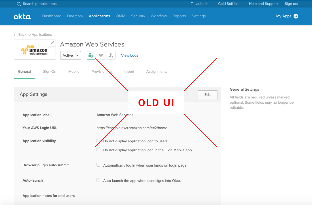
There were many pages of technical settings for each integration
Simplify our approach to describing and building integrations
Created requirements, led design process, helped teams leverage the approach
We use the word “integration” to describe any connection between our product and an external software system. Integrations are the primary way that settings inside of our product impact the real world. Because of this, it is very important for the in-product view of an integration to provide customers with a clear picture of what the product is doing to the integrated system and why.
I saw that our UI for integrations did not accomplish this. It was focused on implementation, not on impact:
Here's what the UI looked like for an example integration

There were many pages of technical settings for each integration

As we talked about future roadmap, the Product team often discussed adding new types of integrations. I heard folks proposing a myriad of new categories of integrations, even though the new categories accomplished the same things as existing categories. I was afraid that an already complicated system might become even harder to understand and explain.
It was clear to me that we needed a way of thinking about integrations that would simplify and unify these stories. We also needed an example UI to make it concrete and prove it was possible.
I decided to attempt to unify these UIs with a design that:
I used my Information Architecture design as a framework for thinking about the primary goals of a customer relative to integrations.
This new IA had already taken into account all the future features and directions we anticipated, and was already oriented around high-level customer goals. There were four places an integration could surface in the new IA. Therefore, I reasoned that there were four goals an integration could serve:
Every existing category of integration (and every hypothetical future category I'd noted in my IA interviews) was described by some combination of these 4 goals. The differences between the categories were a. which combination of goals were covered, b. what technology powered the integrated system, and c. what technology allowed our product to communicate with the integrated system.
I reasoned that the technology powering the integrated system and the technology that allowed communication, while important details for building and enabling the integration, were actually not that important to the goal itself. I also reasoned that since the goals were separated in the IA, they were able to be treated somewhat independently within a given integration.
Given this, I started working on an integrations UI that was built around the following modules:
I then began splitting the settings up into these modules. I wanted to clearly surface the goals, information critical to understanding the goals, and settings that changed the quality of how the goals were served. Anything else, anything that simply allowed the goals to happen would surface only when needed. This drove a lot of consistency, simplicity, and clarity.
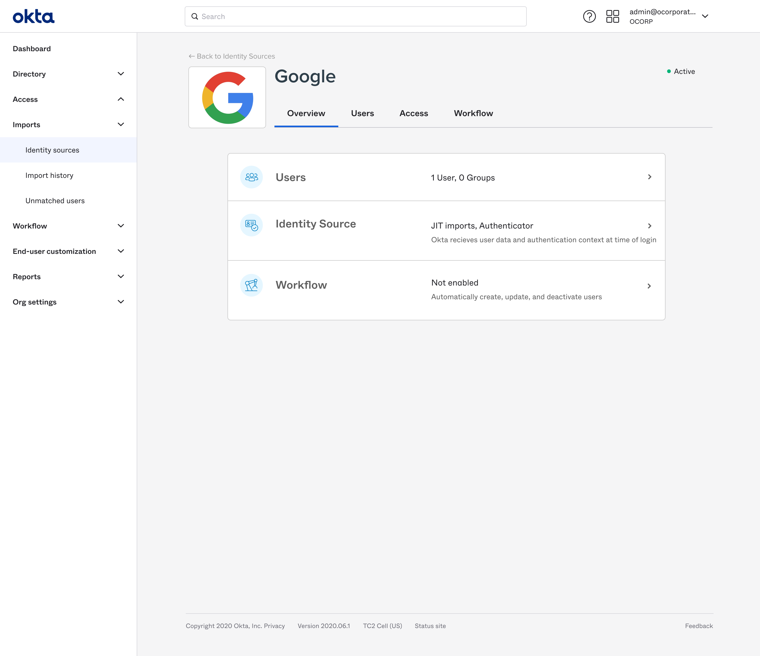
I iterated a lot, gathering feedback from designers and PMs about how this fit their mental models and supported their thinking. We ended up combining imports and authentication into a single module, “Identity Source“, because the usecases were similar and there were many overlapping settings. When we were aligned, we ran a usability test to check that admins could easily understand, configure, and manage integrations for our primary usecases.
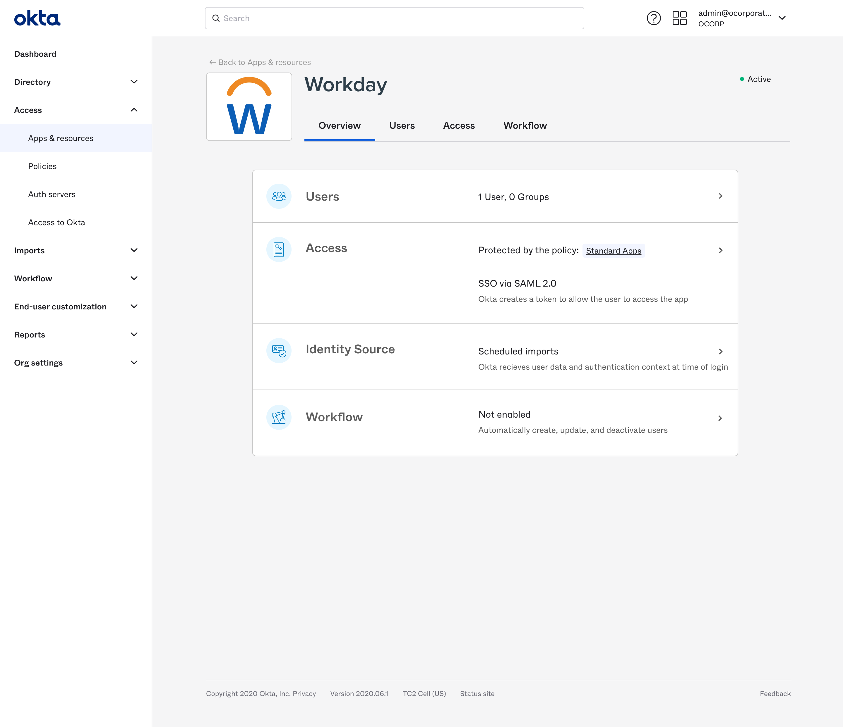
The solution was a framework for thinking about integrations and their capabilities that helped to organize our approach. It was also a modular UI that looked and behaved similarly across all existing integration categories.
The app's overview screen
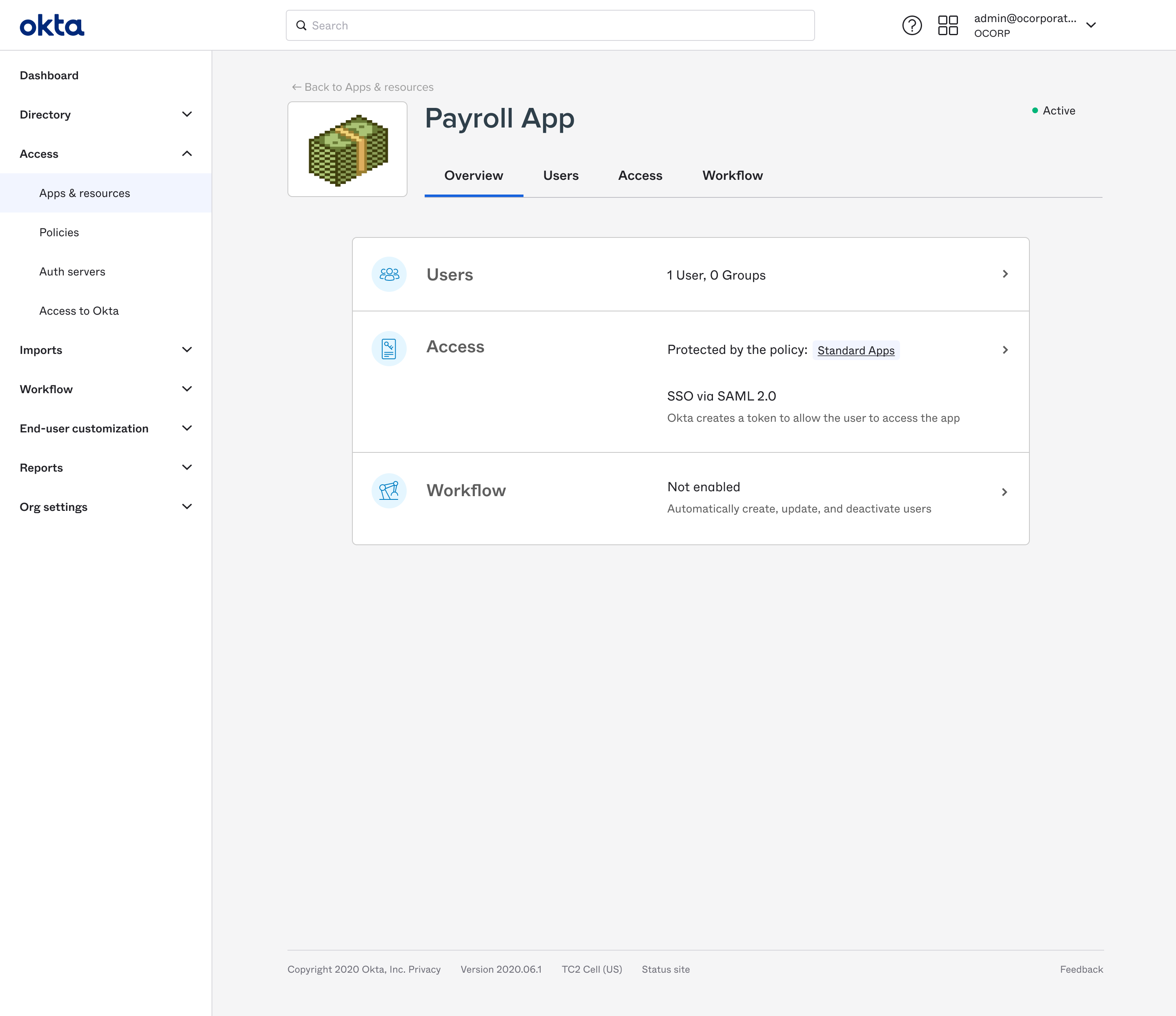
The app's access settings. You can see the policies it is using and how they affect the app.
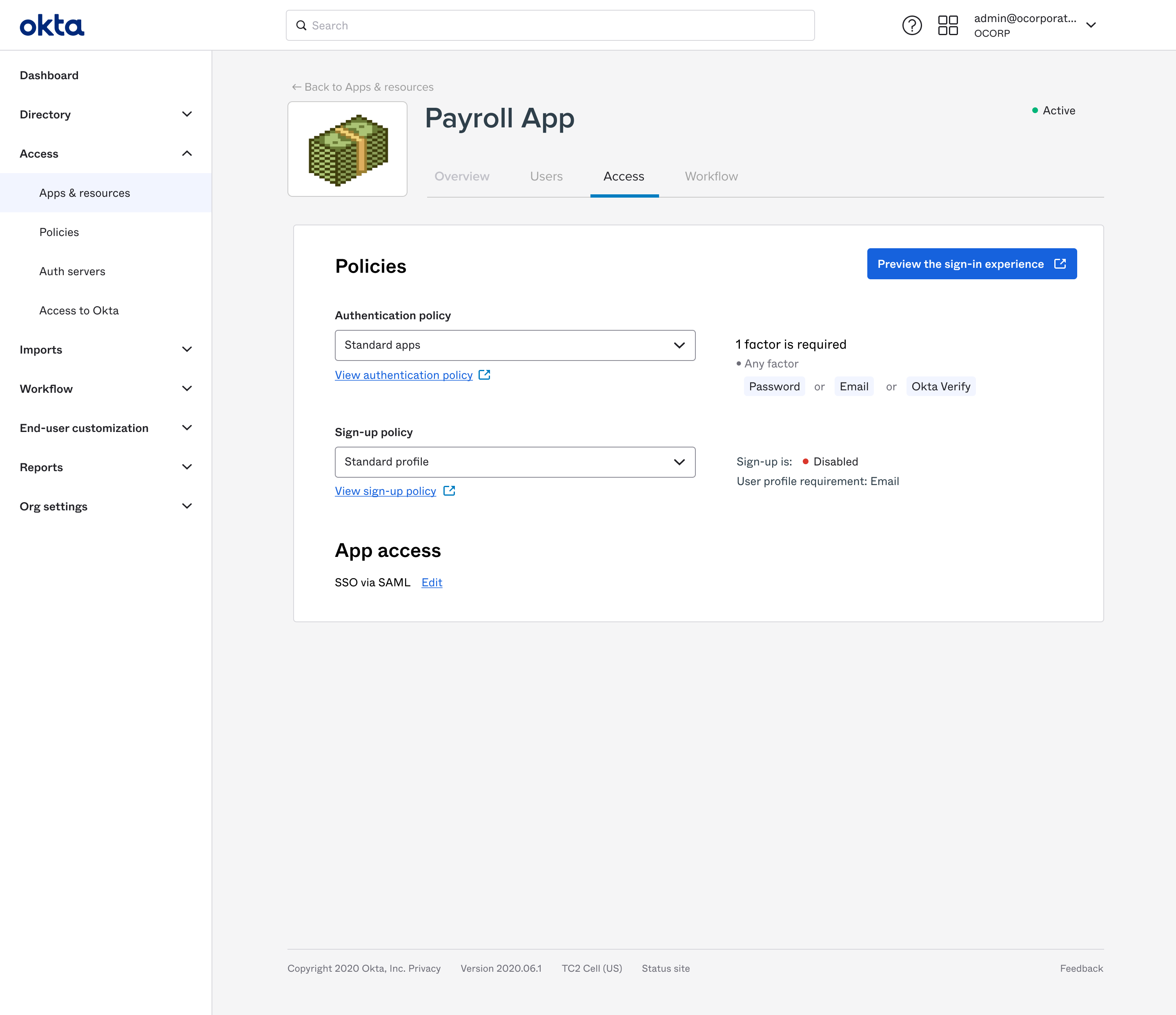
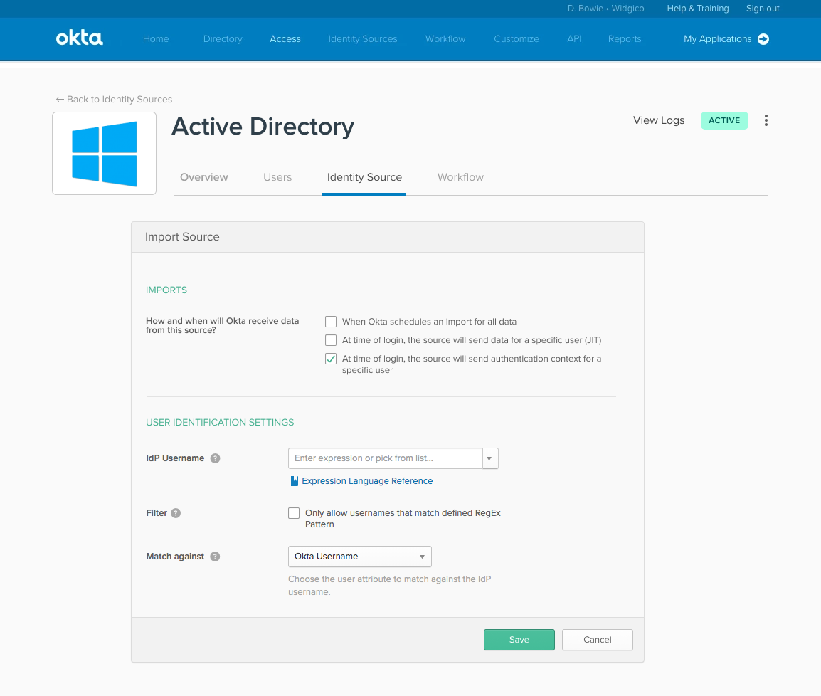
The directory's overview screen
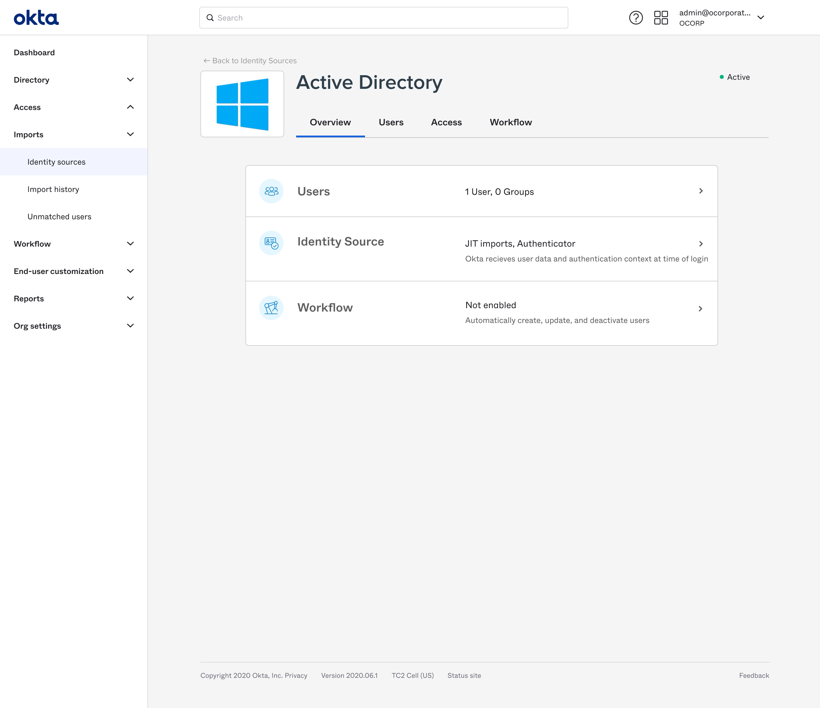
The directory's goal-oriented identity source settings
