taylor laubachdesign
Lack of organization
Our product had started with a very narrow feature set, and as we added one feature after another, eventually the original information architecture just couldn't hold all the new things we'd added. We needed new nav for our product. And we needed a clearer story for what our product did.
Observation
I was observing a number of anecdotal indications that something was amiss:
- In user tests (not aimed at testing IA) customers regularly had trouble finding their way around the product.
- New members of the Product team struggled to understand what the product did and how the parts of it fit together into a whole.
- Feature teams often had trouble deciding where new features should go.
- There was duplication of pages that did very similar things.
- The duplicate pages lead to one-off implementations and duplicate code which was turning into a maintenance nightmare.
Analysis
Seeing the opportunity to reduce complexity, align teams, and tell a clearer story to our customers, I began by documenting some obvious problems.
Duplicate Functionality
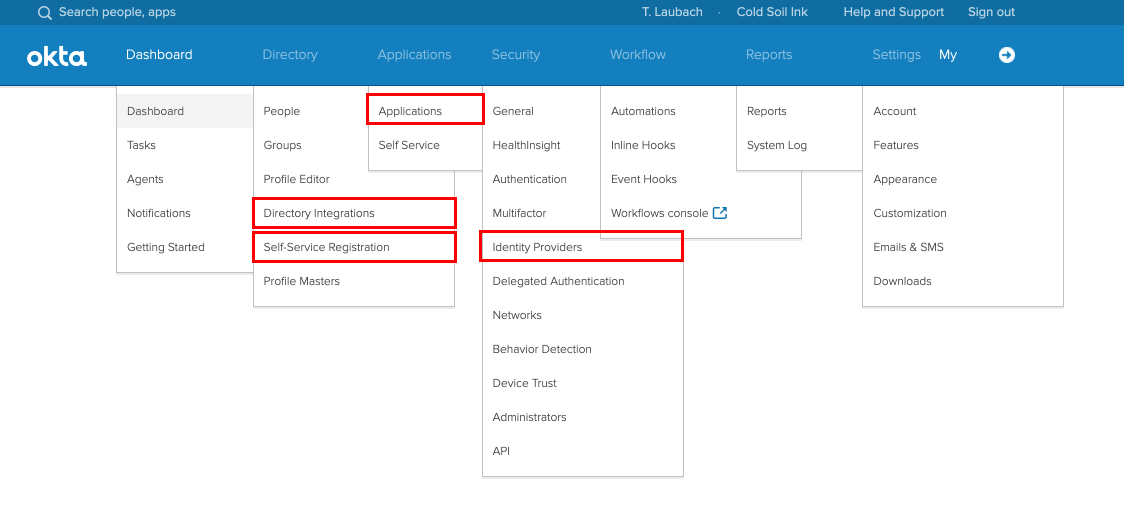
There were 4 different ways to import users. To see where your users were coming from, you had to check all 4 places.

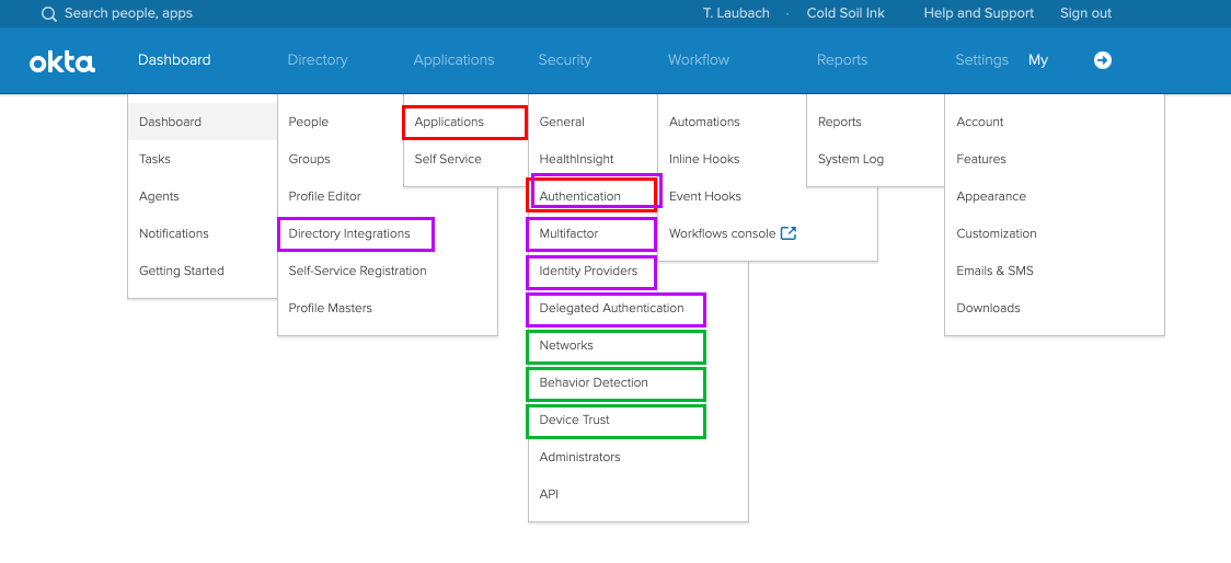
To decide the security and user friction of access management settings, there were 13 different pages, many of which described the same system behaviors.

Learning and Buy-in
Talking this over with the Design team, we decided to start with a usability test focused just on nav. Our research team ran a tree test and found that existing customers had a 30% success rate in finding the correct page for a setting. We used these results to get buy-in from PM that there was a concrete problem that needed solving.
Next, I made a list of every feature in the product. I interviewed all of our product managers to make sure I hadn't left anything out, and I got their takes on future roadmap and directions the product might go in the future. Then I started trying out different ways of organizing the product. I tried lots of iterations, holding collaborative sessions with PMs and designers. Eventually, two logical approaches started to take shape.
Two possible approaches
- Object-oriented – Each system object would have one place it lived. These were grouped by object types. It was really clean, it matched how we thought internally, and it would scale.
- Goal-oriented – This was messier from an internal perspective, and there was resistance to this approach. But as I explored the resulting user flows, I saw that this would make it much easier for the product to guide customers in achieving the goals the product supported. And because the over-arching goals were consistent in the long term, this approach would scale too.
I pushed for the goal-oriented approach. I told the goal-oriented story to new team members as they joined. I used this to further refine and clarify the story. And I saw that this story helped them grasped the basics of the product. When it felt honed, we user tested it. It was clear that structure fit how our customers thought. We made some tweaks to the naming of categories and pages, and we moved some pages around. We did 4 rounds of testing. In our final user test, task completion was 90%. We had found an information architecture that would scale for the future and had broad buy-in across the Product Team. More than that, we had a story we could use to talk about the goals our product supports for our customers.
Shared story
The solution was 5 categories that summed up our product. They formed the foundation of a new information architecture, and gave us a new approach for how we explain to customers what our product can do for them and how to get it to do that.
A story of 5 categories
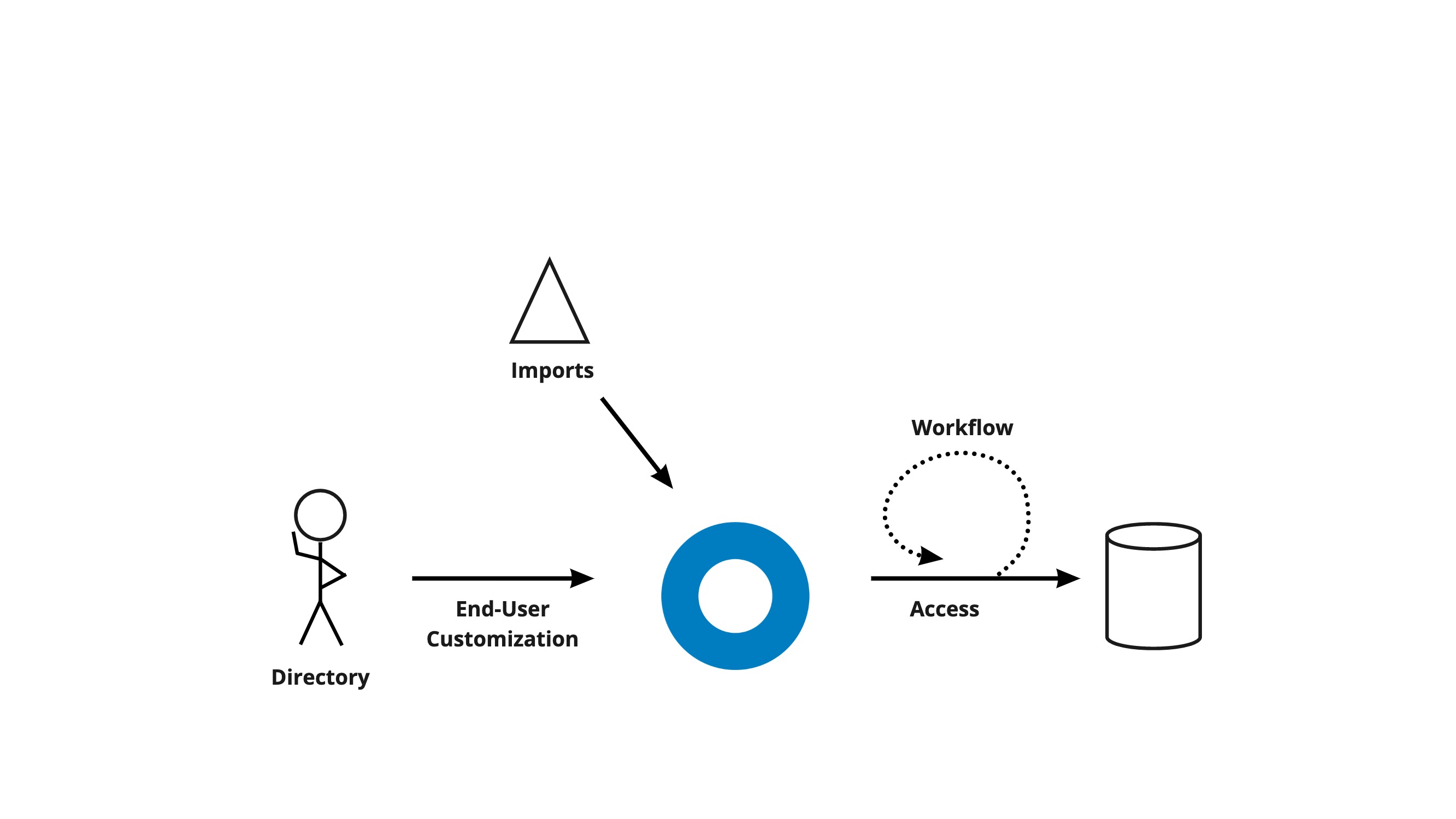
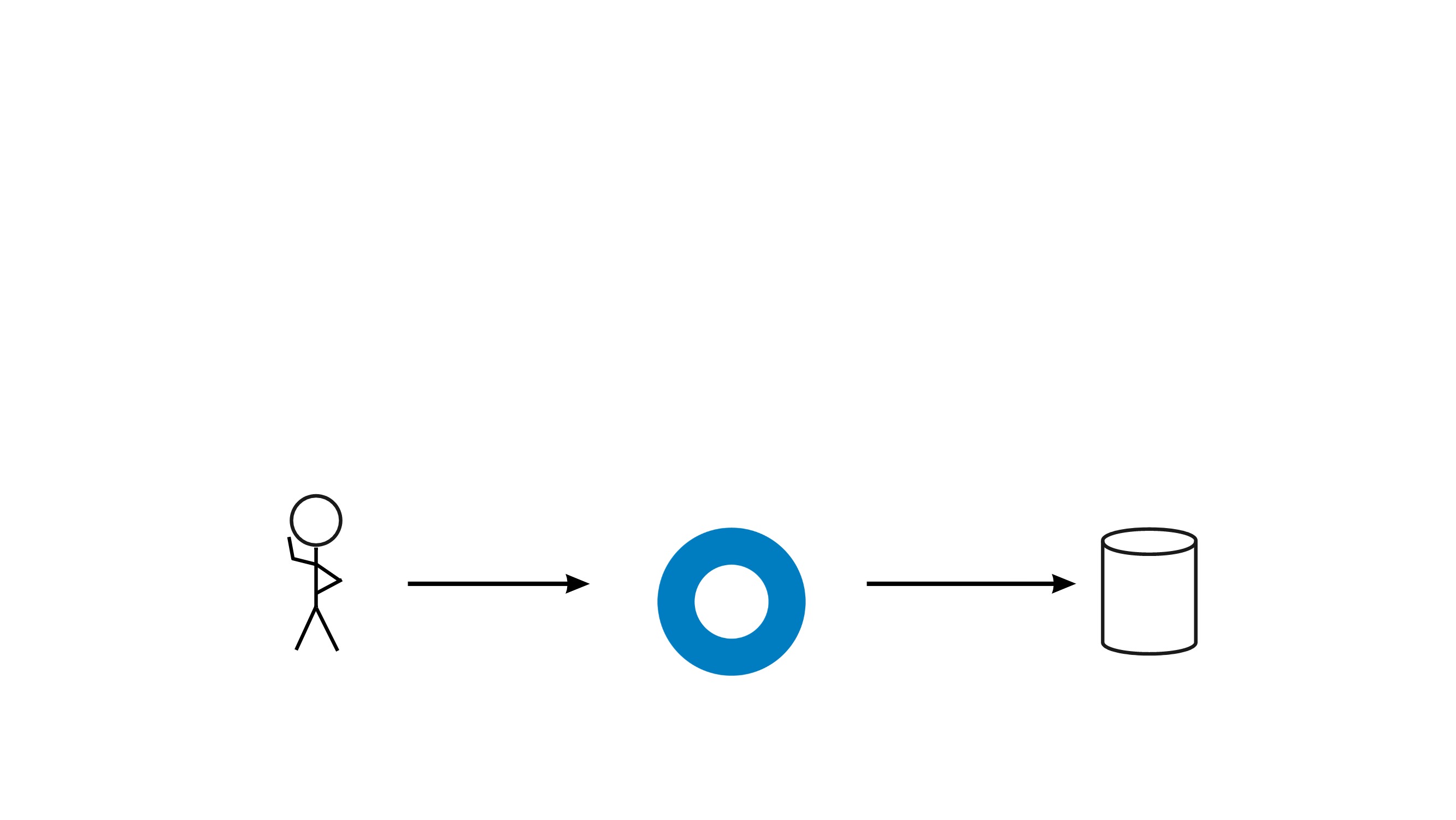
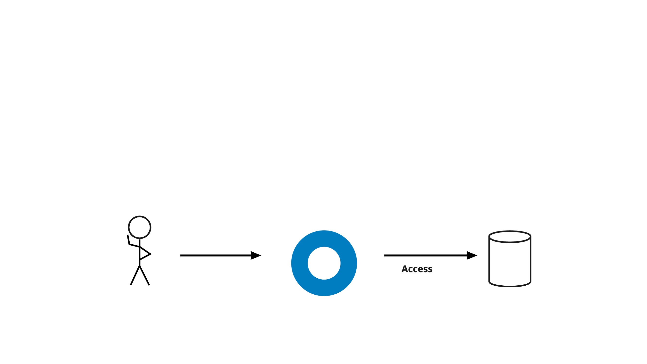
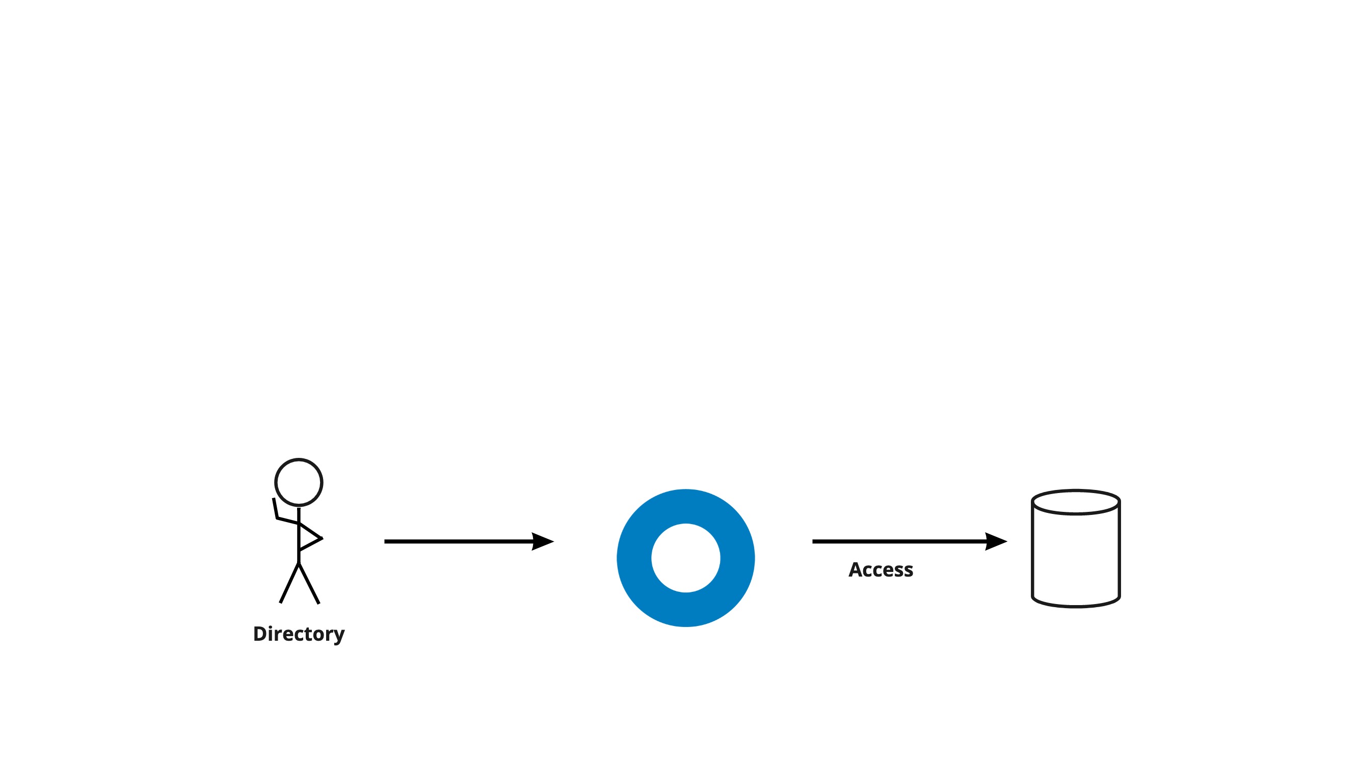
Our product's mission is “Connect people to technology”

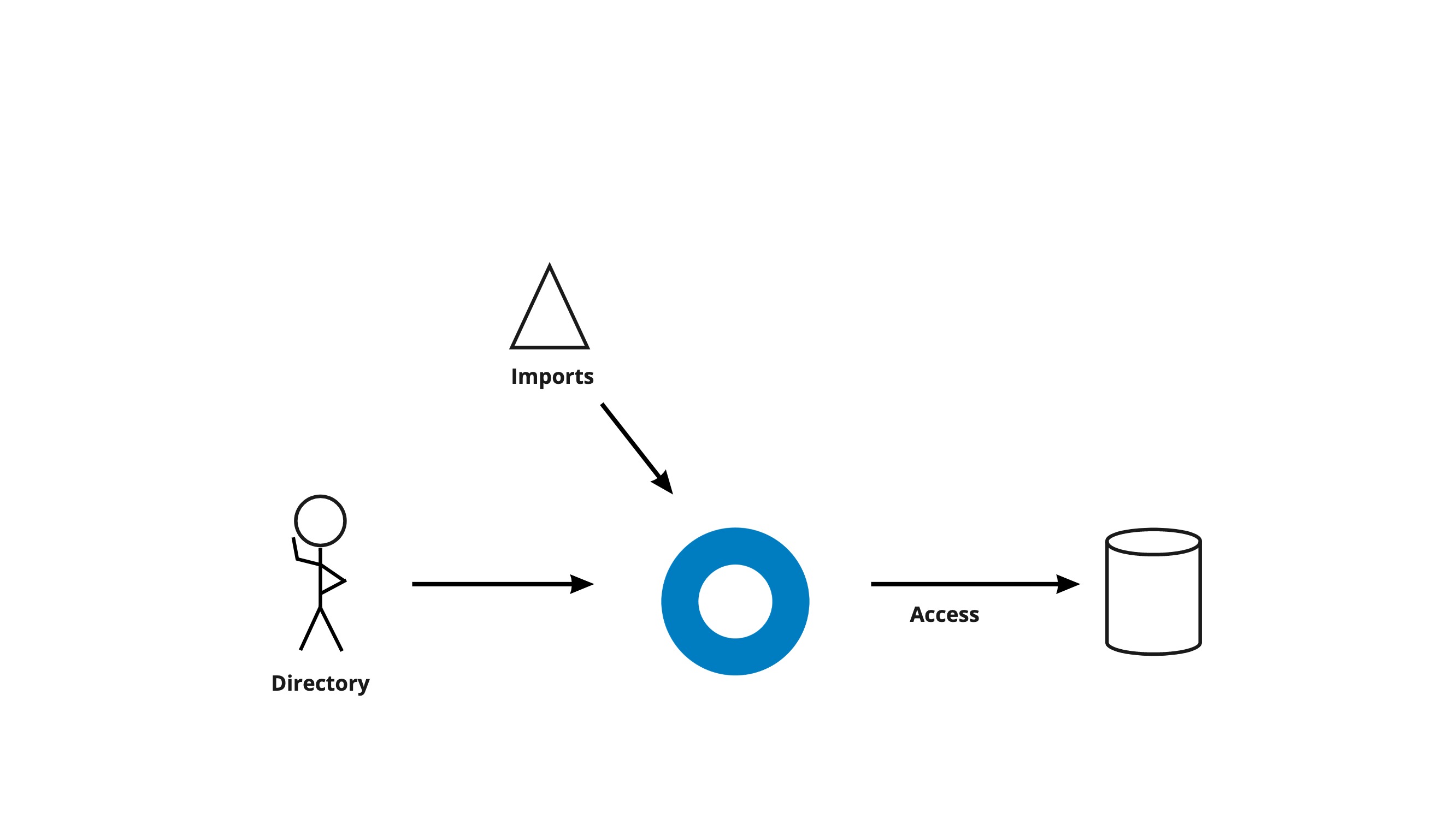
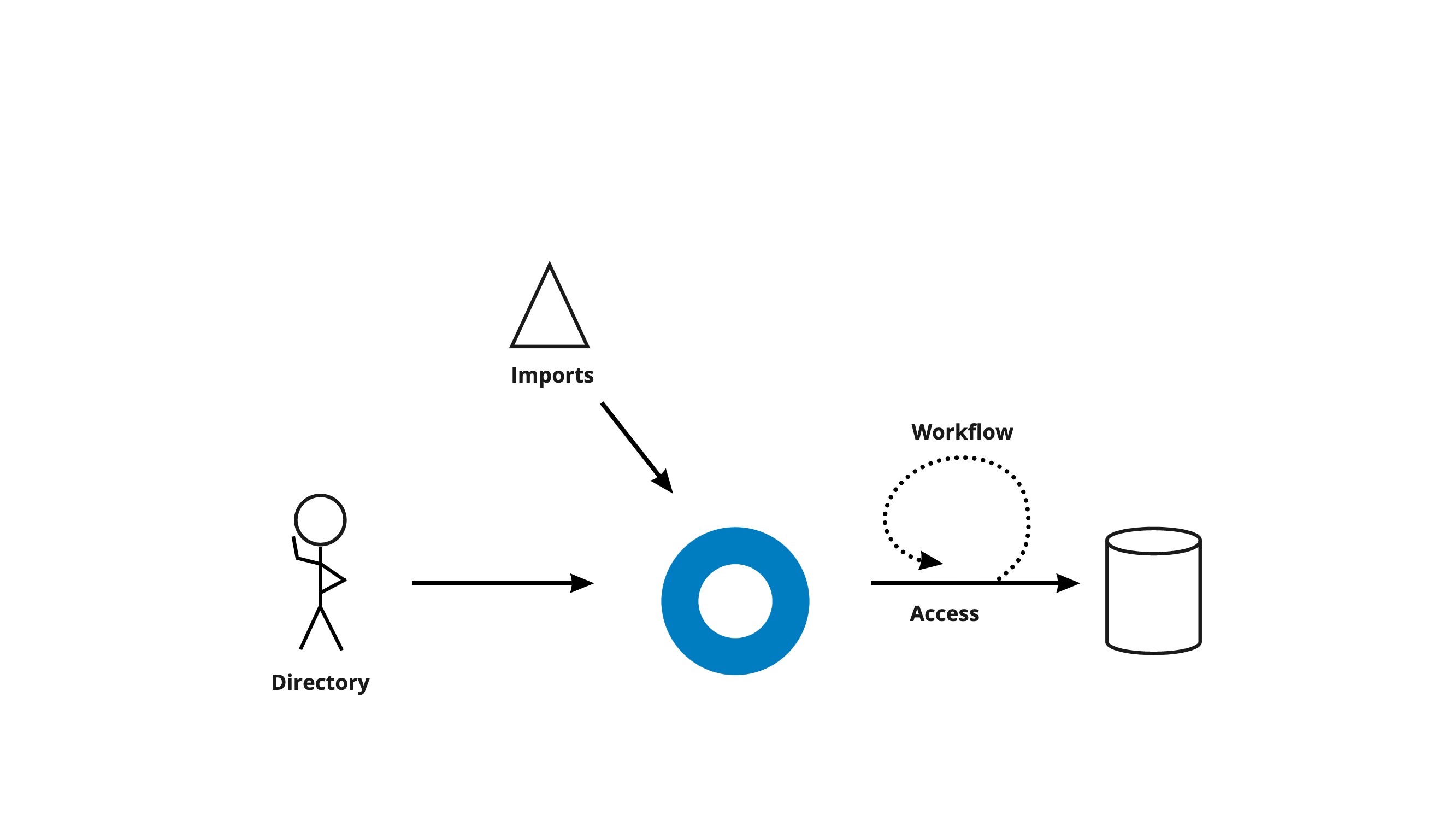
To do that, we need to support access to resources. This means ensuring the right security level to protect the resource and also communicating with the resource to allow the user to access it.

We also need to know who the user is. We need directory that stores user accounts and allows customers to take actions on those accounts.

Because user accounts often live in other systems of record, we need to support customers importing their user data.

There are many actions a customer admin might take to facilitate access. Workflows allow us to automate these actions on behalf of an admin, reducing their workload. For example, if an app like Salesforce doesn't have an account for a user, then Salesforce won't know what to do when the user arrives with an access token. Instead of the admin having to create and delete accounts in every app, we can automate that process.

Finally, customers' end-users interact with our product across many touchpoints (including sign-up forms, authentication flows, and system messages that are sent via email or SMS). Customers need to be able to customize these touchpoints to be consistent with their company's tone and branding.
