Best practices and examples

Provide our customers with more useful error messages
Led design. Worked with teams to change processes.
I had repeatedly heard customers complain that our product gave them unhelpful error messages. I wanted to fix this.
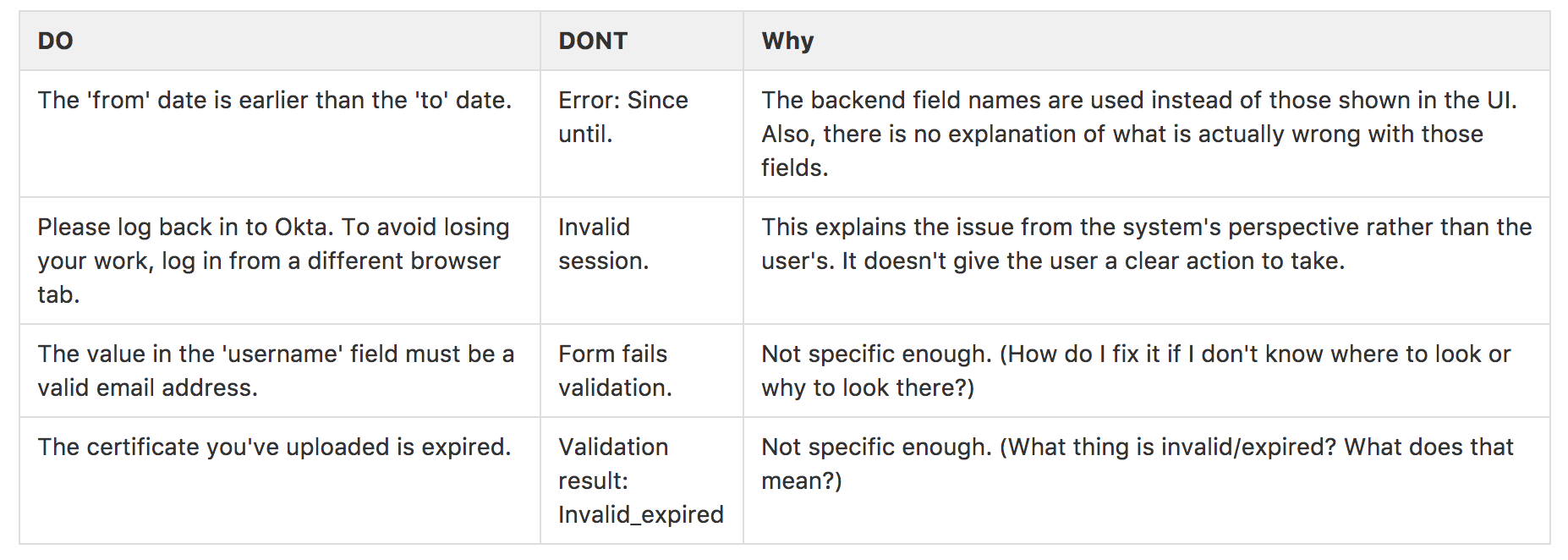
I started by gathering my thoughts and doing research on best practices. I used this to create a document that would define:
Errors occur when a user is in danger of failing. The error message is our last chance to make the user successful. To do this, the error must tell the user what's gone wrong, and what the user can do to fix it. The error must name things the user can actually look at or see and must use the same names that are presented to the user.

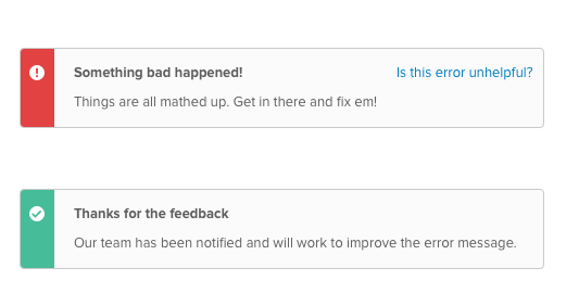
Next, I began combing our code to review existing error messages. I saw that there were thousands of them. It was not possible to tell what context they surfaced in, nor whether they were surfaced to users (versus internal error messages). I deemed it impractical to try to fix them in a comprehensive manner. The best way to fix them would be to allow users to flag when an error message was not helpful.
For future error messages, I realized that a primary underlying cause for our existing error message problems was that our error messages had been created without collaboration between Engineering and Design. Both sides were necessary to create an effective error message. Engineering understands the causes of an error and the actions that would address it. Design understands user mental models and the UI steps a user would need to take.
For existing error messages, I created a UI pattern that would help us to identify error messages that did not achieve their goal.

For future error messages, I created some frameworks to help ensure error quality and began a campaign to raise awareness of the importance of error messages and the steps that could be taken.
The cultural shift of seeing error messages as customer communication was highly effective. 3 years on, I see Engineers across the company checking that Design was included in PRs that contain error messages. My framework has been a very useful tool for driving alignment when we discuss the contents of an error message.
Here I am giving a presentation on error messages
