User flow
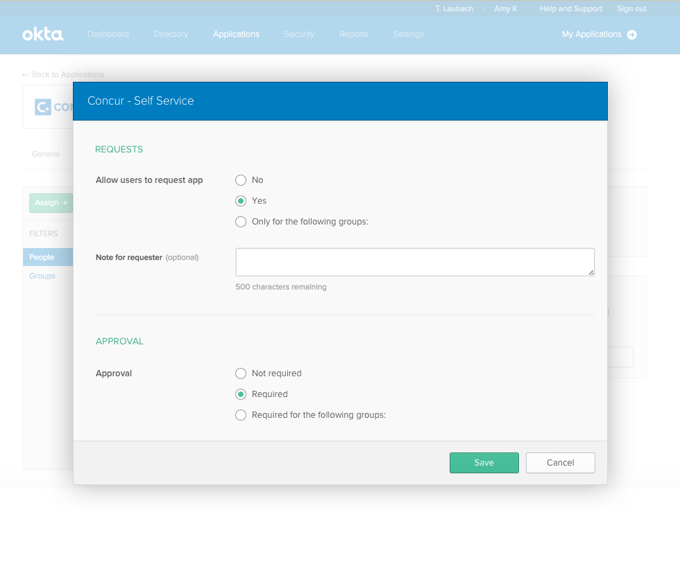
Step 1: No dependency exists until the dependent setting is selected
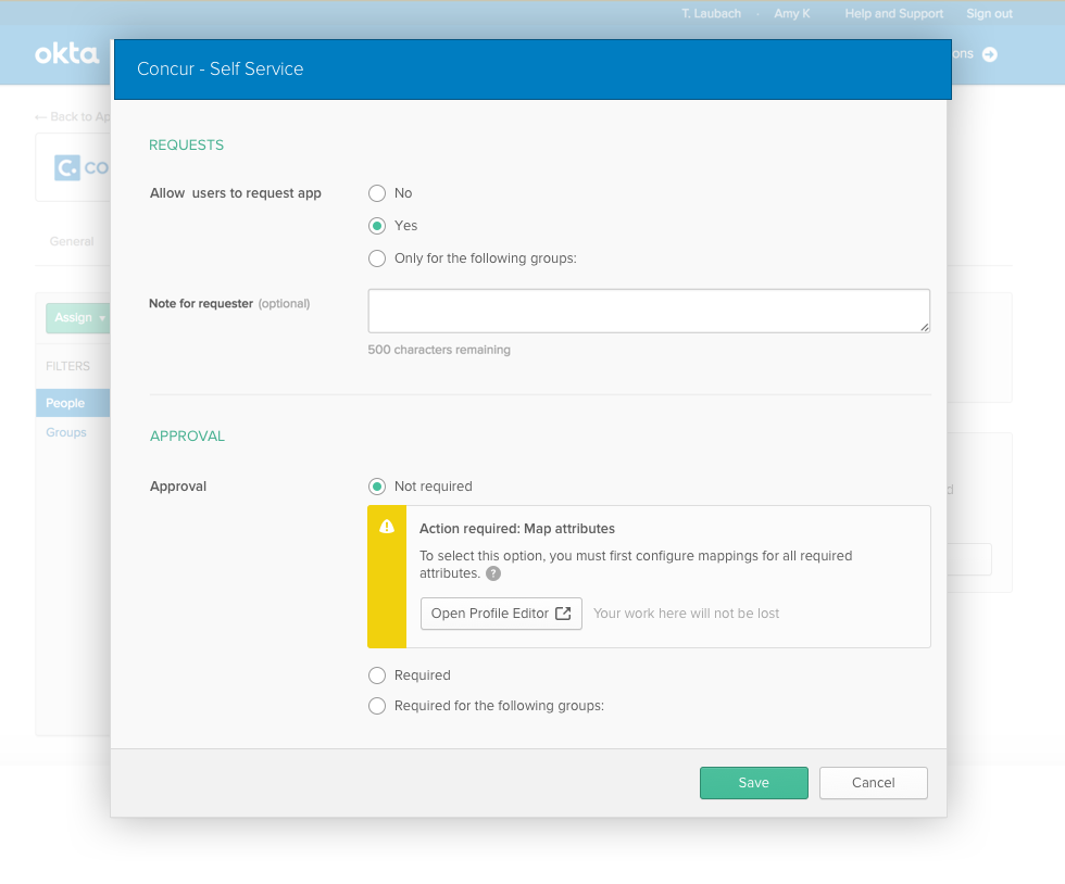
Step 2: After the dependent setting is selected
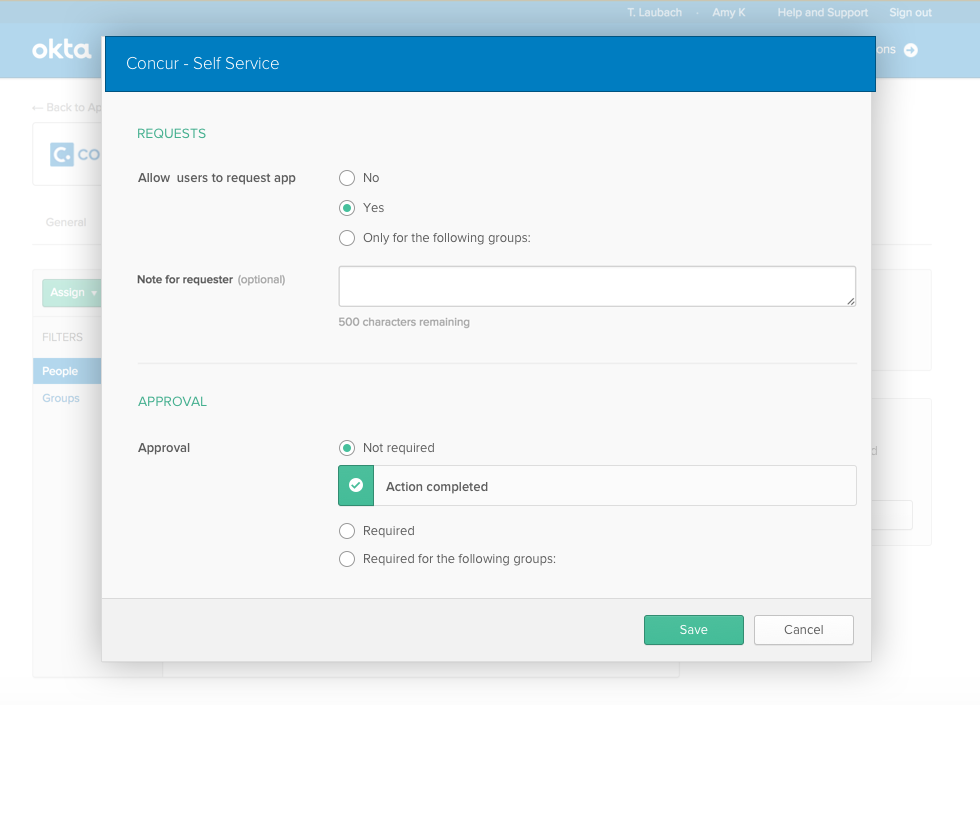
Step 3: Confirmation after the dependency is resolved

Prevent admins from failing when a setting they wish to save has a dependency on a different page
Identified the problem. Led design. Worked with UI team to get it implemented.
Our product contains many settings that don't work unless other settings are set a certain way. When a customer configured a setting with an unmet dependency, the system was unable to check for or tell them about the dependency until after they tried to save. This was frustrating for customers. I wanted to find a more elegant way to handle these situations.
Re-architecting the product to address one of these dependencies would likely be a lot of work. And there were many of them. I didn't need to make things perfect, I just needed to create a tool that would enable teams to prevent customers from failing.
Thinking through the problem, I realized that a successful solution would need to have the following aspects:
I tried a design where the dependent setting was disabled, with an unobtrusive message explaining why. In user testing, no one saw the message. Many admins didn't even notice the setting was disabled. Some clicked the disabled setting repeatedly and then, when nothing happened, clicked “Save” in the hopes that maybe the settings they wanted would be saved. Almost no one understood that there was a dependency or how to fix it.
I saw that I needed a more obtrusive message. However, I didn't want this message to show all the time—it was noisy and would often not apply to what a user was doing. I opted for enabling the setting even though it couldn't be saved. This allowed me to show a warning callout in line at the moment the dependent setting was selected. This ensured an admin would see the dependency at the earliest moment that the system could know the dependency existed but no earlier.
This solution performed quite well in user testing. I refined it, coordinating with Design, Product management, and Engineering. I submitted the design to be added to our design system, and it was built out to allow this pattern to appear anywhere that a combination of settings would result in a dependent flow.
The solution is an inline warning callout that appears when a dependent setting is selected. It has a consistent icon and title: “Action required: {Action}”. It contains an explanation of the dependency and a button to go to the dependency and come back.
Step 1: No dependency exists until the dependent setting is selected

Step 2: After the dependent setting is selected

Step 3: Confirmation after the dependency is resolved
